

Is your site loading slowly on mobile? One quick and effective way to improve page load speed is to use responsive images.
Your mobile device is going to consume a lot of bandwidth if it tries to load a hero image meant for large, high resolution displays. Using responsive images means loading images with different sizes based on different breakpoints, and it can greatly improve page load speed on mobile devices.
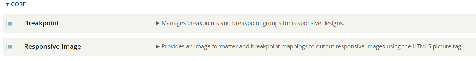
Drupal makes use of two modules to make it easy for editors to choose the right image size for each display size: Responsive Image and Breakpoint. This article shows how we set up and use this functionality.
Creating Breakpoints
Once we enable the modules, we can start creating the breakpoints. First, we create a breakpoint.yml file inside our custom theme:
- custom_theme.breakpoints.yml
In this file we add all our necessary breakpoints. Let's start with 3 basics: small, medium and large.
To set up a breakpoint we need a label, a media query and a multiplier. The multiplier will be used by browsers on retina displays to load the corresponding image based on the pixel density.
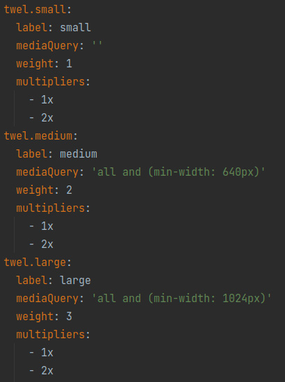
Image Styles
Now we can create the image styles that will be used with the breakpoints.
Instead of creating tons of image styles for each component, we use the approach of creating image styles based on aspect ratios (1:1, 4:3, 4:5, 16:9), that way we can re-use most of the image styles in more than one place.
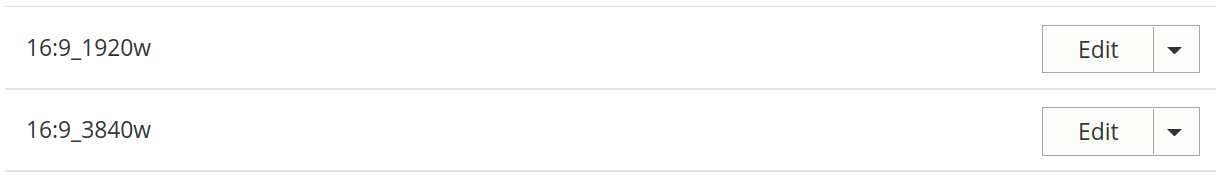
Note that we create two image styles, one for normal display and another for retina display which doubles the pixel density.
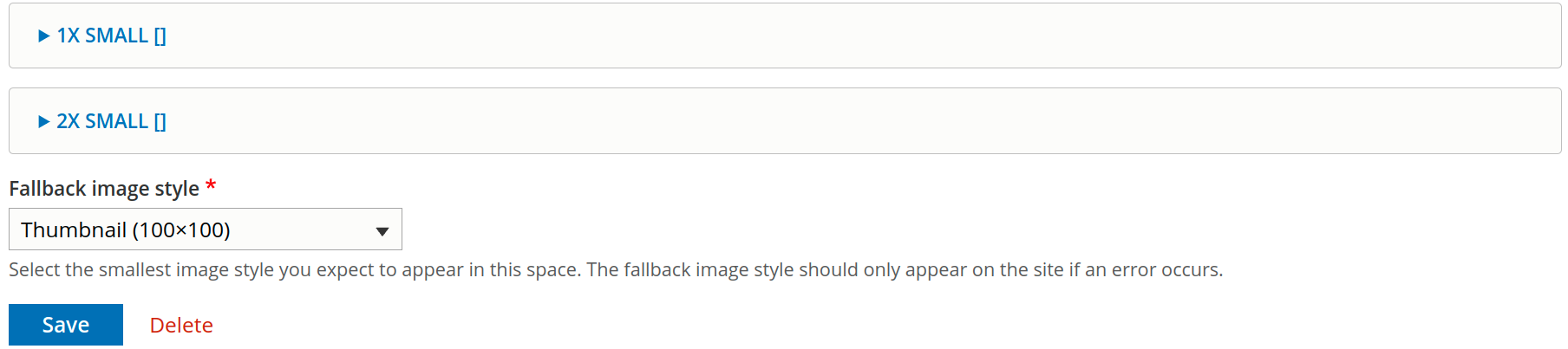
Responsive Image Style
Now we create responsive image styles using the Responsive Image module. Each style can correspond with a component - a Hero, for example. When configuring the style, we select a breakpoint group from the custom theme.yml. The fallback image should be the smallest image style available.
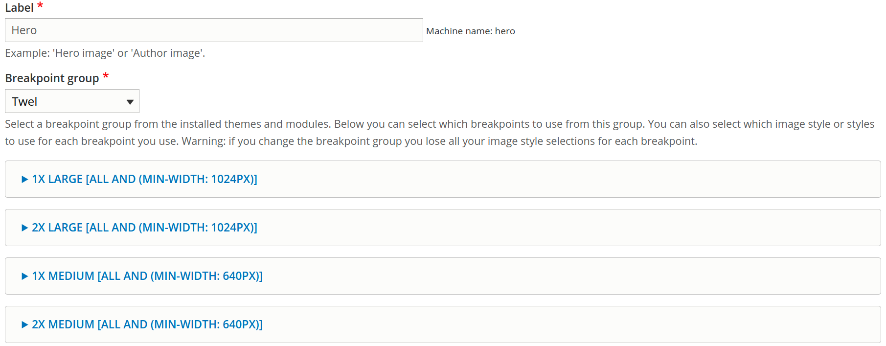
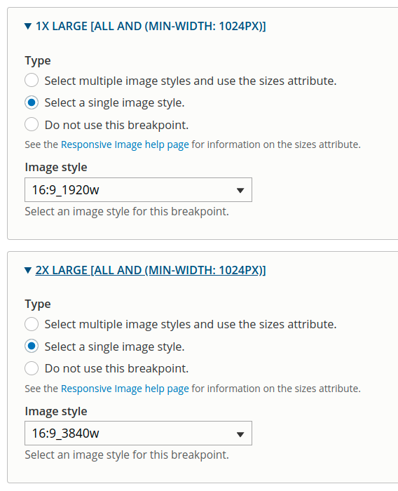
Next, we assign image styles to all breakpoints.
Setting up an Image Field
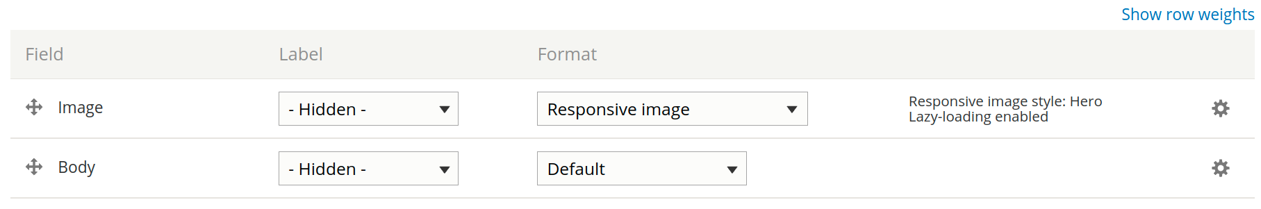
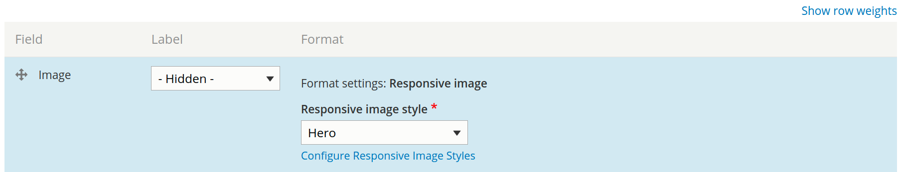
Once all of the responsive image styles are ready, we configure a content field image/media under the Manage Display tab for each component, and set the Format to Responsive Image.
Then on the image field settings we add the specific style we created.
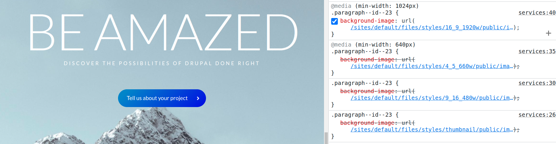
Background Images
So, how do we treat background images? We use the Responsive Background Image module, which provides a method to be called programmatically from within a preprocess function. It will generate CSS media queries for a responsive background image for a specific CSS selector and gets the job done.
This module works specifically with Paragraphs (although it could work with any fieldable entity, but it is mentioned on the project page that it hasn't been tested yet), the example code can be found in its documentation.
This is one of the strategies that can improve sites images serving performance, and can be combined with other best practices as well, for example:
- Lazy loading images (Default in Drupal 9.1 and newer versions)
- Using WEBP image format
Do you feel your website is sluggish or facing problems with heavy images to load totally ruining the user experience of your website's visitors? Let's fix it together
References:
- Responsive images and media type (https://gole.ms/guidance/guide-media-and-responsive-images-drupal)
- Responsive images on Drupal 8 (https://drupak.com/blog/responsive-images-in-drupal-8)
- Responsive images documentation (https://www.drupal.org/docs/mobile-drupal-sites/responsive-images)
- Responsive background image module (https://www.drupal.org/project/responsive_background_image)
- How to use responsive background image module (https://www.drupal.org/docs/contributed-modules/responsive-background-image/how-to-use-the-responsive-background-image-module)